Basic Excel Charts by Deborah Ray
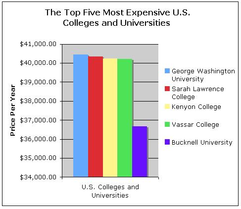
The bar graph represents the cost of five of the
most expensive universities of colleges in the United States. Each separately colored bar represents an
individual institution of higher education.
The price of each college or university is indicated where each bar ends
on the scale on the left hand side of the page.
George Washington University was found to be the most expensive
institution, costing roughly $40,400 a year.
Sarah Lawrence College was found to cost $40,300 a year. Kenyon College and Vassar College are nearly
equal and estimated to cost nearly $40, 200 a year. Bucknell University is the least expensive of
the five, costing roughly $36,700 a year.
From the graph, one is easily able to identify the five most expensive
colleges and universities in America as well as how much each cost.
Basic Excel Charts by Deborah Ray
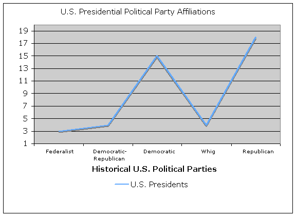
The line graph above depicts the total number of Presidents who had political ties to political parties that have existed throughout American history. The five political parties represented on the graph are the Federalist, Democratic-Republican, and Democratic, Whig and Republican parties. The left side of the graph indicates the number of presidents who have been associated with a given political party. For example, the Federalist party has only had three presidents elected from its ranks, the Democratic-Republican party had four presidents elected, the current Democratic party has had sixteen presidents elected throughout history, the now extinct Whig party only had two presidents elected and the Republican party has seen eighteen presidents elected since its emergence into political history. From the graph, one is able to clearly understand what political parties have existed throughout American history as well as clearly view that the Democratic and Republican parties have been extremely successful in presidential elections.